When we first started utilizing HubSpot and became a HubSpot Partner Agency in 2015, HubSpot looked a lot different. The platform itself looked and functioned differently, there was no Sales Hub or Service Hub, and the HubSpot CMS was known as the HubSpot COS (and was really an afterthought).
Needless to say, a lot has changed in the last six years. And it seems like more and more is changing by the day with HubSpot. Earlier in 2020, HubSpot rolled out themes. It was a monumental shift in the way the HubSpot CMS functioned as well as how things like landing pages, thank you pages, and blogs were built and managed.
If you're familiar with WordPress, you should understand the concept of themes. Essentially, themes are a way to unify the look and feel of your website, landing pages, thank you pages, and blog by encapsulating it into a single theme. The theme, though very flexible, is meant to keep everything consistent for your users from one page to the next and one piece of content to the next.
Before themes were rolled out, you really had to pay close attention to your work to make sure you were monitoring your consistency and user experience. In the old builder, you would create a global header and footer and would need to make sure that they were used in every single template that you created so that they were consistent. You always ran the risk of using the wrong header or footer in a template and breaking that consistency.
Then, you would have to build out your templates in that drag and drop builder. This was a little too complex for non-technical marketers yet a little too basic for developers. Plus the front-end experience of building out a page was limited in how you could style and layout your modules and content in the previous builder. That's why themes were created.
What has changed in 2020
In short — A LOT. HubSpot rolled out new platform designs, created the HubSpot CMS hub with the Professional and Enterprise levels, created a ton of new native integrations, revamped the app, asset, and solutions partner directories, beefed up the functionality in workflows, and of course, launched themes (among about a million other changes).
It has been a major year of growth for HubSpot, even though they had to move their INBOUND 2020 conference online (thanks a lot COVID).
What are HubSpot themes?
A Theme is a portable and contained collection of developer assets designed to work together to enable a marketer-friendly content editing experience. Themes and all of the files within themes are designed to be portable between environments and accounts. Themes allow developers to work with coded files, and use the tools, technologies, and workflows they prefer, while offering a flexible content creation experience for marketers, supporting layout, style, and content updates all within the content editors. [HubSpot]
In short, HubSpot themes give developers the flexibility and control they need to create great websites and also give non-technical marketers the ability to create great pages and designs without the need to mess with templates or global settings. It really is a win-win.
Why did we build a theme?
With the announcement of the HubSpot CMS Hub (Professional and Enterprise) as well as the rollout of out-of-the-box themes, we knew that it was just a matter of time before the development of custom themes was open. Then came the HubSpot Themes Challenge.
In August, HubSpot announced their Themes Challenge that was open to all HubSpot Partner Agencies.
The purpose? To create great free and paid assets for the HubSpot Asset Marketplace so that more companies would have the ability to get up and running with the HubSpot CMS quickly and efficiently.
We decided that this was our chance to get started with HubSpot theme development.
Our Themes
For the Themes Challenge, you had to choose whether you were going to build a free theme or a paid theme, meet all the requirements for a theme (regardless of price), and meet all the requirements for the asset marketplace. It was no small task. In order to be considered for the challenge, your theme had to be accepted into the HubSpot marketplace by December 4th.
There were over 400 agencies that registered for the theme challenge and only about 40 made it into the marketplace. That included 13 free themes (two of which were ours).
Just looking at the fact that only about 10% of agencies made it into the challenge after registering speaks to how difficult the challenge really was.
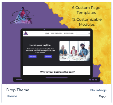
Like I mentioned, we submitted two themes (both free themes) for the challenge - the Drop Theme and the Buzz Theme. Both themes are packed with custom features and modules and ready for any business in any industry.
My theme was the Buzz Theme and it includes:
- 1 unsubscribe template
- 2 blog templates
- 1 subscription update template
- 1 search results template
- 2 error page templates
- 1 password template
- 1 subscription preferences template
- 10 page templates
- and 16 custom modules
Of the custom modules, we even included a few that will be paid modules in the marketplace soon like our podcast module (allows you to embed audio on your webpage - the first of its kind in the marketplace), hover blocks modules (2, 3, and 4 column blocks with special hover effect and 2 calls-to-action), and our three-column re-arrangeable module that allows you to drag and drop all columns in whatever order you need them in.
It's meant to be a theme that can work for any company in any industry.
My biggest takeaways
The process of building a theme was not an easy one. There were a lot of hoops to jump through and a lot of obstacles to overcome. HubSpot definitely didn't make it easy on us to get our themes into the marketplace, but really that is a good thing. One of the biggest complaints that I have with WordPress is that there are so many developers from all over the world that have carte blanche over their development which has resulted in a ton of useless, poorly developed, and even vulnerable plugins, extensions, and themes. HubSpot never wants to be known for that. That is why they have made it so difficult to get into their marketplace. They only want high-quality assets available there.
With the addition of themes, we have also found that the flexibility for marketers has skyrocketed. You truly can create anything you can imagine with the front-end builder. The nearly infinitely flexible sections, columns, and rows make it possible to build the page you need without having to edit templates.
One downside to themes (for marketers at least) is there is a much bigger need for coding and a true developer on the theme side. Since HubSpot has gone away from their drag and drop template builder to a code-based theme process, the average marketer will not be able to create their own theme. It has opened up a whole new world of flexibility and functionality to developers though. It should also be mentioned that the average marketer really shouldn't need to build their own theme. There are now 19 free themes in the marketplace that are a great starting point for any new HubSpot CMS website.
I believe that the move away from the standard drag and drop template model into themes is a huge leap forward for the HubSpot CMS and creates new opportunities and flexibility for both technical developers and non-technical marketers.
Our team is now in the process of beefing up both the Drop and Buzz theme to offer an even more powerful paid theme in 2021. Stay tuned!
Still trying to decide if the HubSpot CMS is right for you? Check out our CMS comparison where we look at the differences between the HubSpot CMS, WordPress, and Squarespace.


.png?width=100&height=100&name=10%20Signs%20Your%20HubSpot%20Setup%20Is%20Failing%20(+%20Fixes).png)
%20Actually%20Tell%20You.png?width=100&height=100&name=What%20HubSpot%E2%80%99s%20Buyer%20Intent%20Tool%20Can%20(and%20Can%E2%80%99t)%20Actually%20Tell%20You.png)
