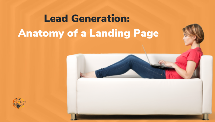
As my friend and colleague at HubSpot, Jacob Carlson (@jacobin617), would say, "Building a website and treating that as your marketing strategy is similar to a putting up a billboard in the desert." Building a website alone is NOT a marketing strategy. Just because you build it, doesn't mean they will come. And even if they do come, it can't be successful if it's not working to create new leads for your business.
In order to have an effective website, you need to give your visitors the ability to convert into a lead. To do that, you're going to need great content, great offers, and landing pages that encourage conversions.
Let's take a look at some of the elements you'll need in order to create an effective landing page.
1. Headline
Does your landing page pass the "blink test"? A concise headline will allow your visitors to understand what the purpose of the landing page is and communicate its value within, well, a blink. You don't need to be fancy here...don't treat it as a newspaper headline, just cut to the point.
2. Lose the Navigation
The last thing you want to do is distract someone so they don't convert.
We want to simplify the landing page so there are no distractions. The navigation gives the visitor extra options and reasons to leave the landing page and fail to convert. Removing your navigation menu places all the emphasis on the content of the landing page and will increase your conversions.
3. Offer
Having the best landing page ever isn't going to do you any good if your offer isn't desirable. If no one wants what you're offering, no one is going to convert. Take some time to understand what your visitors want and give it to them. Make sure to communicate your offer and why they want to fill out your form to receive it.
4. Lists
Simplicity is your friend. The best way to communicate the value of your offer and why someone would want to fill out a form to receive it is a list. With the diminished attention spans of the world today, lists are your best friend. SQUIRREL!
5. Media
Your landing page can't be all text. No one wants that.
If it is, it's probably not going to convert very well. Give your visitors something pleasing to the eyes or something that supports your content. Including an image, video, or graphic is a great way to make your page more exciting, enticing, and engaging. Did you know that including a video on your landing page can increase conversions by up to 86%?!
If you're going to include an image with people, make sure that they are looking in the direction of the content that you want the user to consume. Our eyes will naturally follow what others are looking at.
6. One [and only one] Offer
Did you know that up to 48% of landing pages have multiple offers? That number is shocking.
Like we discussed earlier, we want to eliminate distractions and have all of the visitors' focus on your offer. Giving the visitor multiple options to choose from is confusing and distracting. Stick to ONE content offer per landing page to be most effective.
7. Lead Capture Form
The form is the star of this show. It is all that keeps your visitor from receiving your great content and all that keeps them from converting to a lead for your business. The form should be consistent with the value that you're offering. The higher the value of the offer, the more you can require from your visitor. Be smart about what you're requiring from your visitor. If the information is not valuable to you in your sales process, it's just a waste of your time and your lead's time.
It's a best practice to ask for as little information as possible to reduce the barrier and capture more leads. You can nurture your leads post-conversion to gather more information from them.
8. Sharing is Caring
If your visitors find your content valuable, chances are they know someone else who could also benefit from it. Give your visitors the ability to easily share your landing page with their colleagues through social sharing buttons.
9. Social Proof
Including testimonials from your current customers is a very powerful way to prove your point and enhance the value of your content. Make sure your testimonials are only a couple sentences...no one wants to read a novel about how great you are.
10. Submit?
End your form with a little extra creativity by creating a custom submit button. Change the submit button text to something more interesting than, "submit". Have some fun with it. Downloading an eBook? How about a button that says, "Give me my eBook!"? Your visitors turned leads will appreciate your creativity! All buttons should have an action verb to inspire action.
Landing pages are the one of the best tools you have to convert a visitor to a lead. When you think about designing a landing page, typically less is more. The more you add to your landing page, the more distractions your visitor has to deal with.
Are your landing pages converting at the rate you'd like them to? Use these tips to increase your conversion percentage!
One of the best ways to convert more leads is to really know who your best fit clients are and speak directly to their pain points in your landing pages. Don't have identified personas yet? Download our FREE Buyer Persona Worksheet and get started!


.png?width=100&height=100&name=10%20Signs%20Your%20HubSpot%20Setup%20Is%20Failing%20(+%20Fixes).png)
%20Actually%20Tell%20You.png?width=100&height=100&name=What%20HubSpot%E2%80%99s%20Buyer%20Intent%20Tool%20Can%20(and%20Can%E2%80%99t)%20Actually%20Tell%20You.png)
