Sunday, August 21, 2022, at 9 p.m. EST, was a dark moment for some of us. I remember the moment when I had just opened one of my favorite websites so I could watch the new Game of Thrones prequel, House of the Dragon, and to my disappointment, the website was taking forever to load. I called it blasphemy. I had popcorn and drinks ready to embark on the exquisiteness of George R. R. Martin's fantasy world and dance with the dragons on Vhagar’s back in my imagination. So imagine my frustration when I left the website after only seconds of waiting for it to load properly.
Did you know that the average time it takes someone to leave a website with poor performance is only about three to five seconds? Experts disagree on the exact time, but I think we can all agree that it takes the blink of an eye to abandon a slow website.
This generates the question of how we, as developers, test a website's performance and how we can score well on these performance tests. Today, I share the secrets to scoring an A on a website performance test.
Breaking down the Web Performance Test
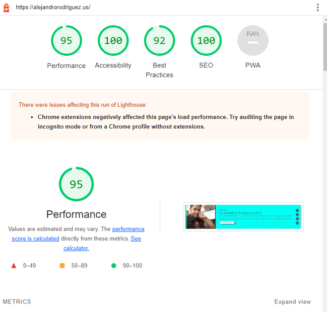
First, let’s talk about how our sites are tested. There are a lot of tools available to test website performance that will provide you with a full analysis of all the factors that affect a website's visibility in search engines. Factors such as
- Performance
- Accessibility
- Best Practices
- Search Engine Optimization
- Progressive Web Application (PWA) — commonly known as a progressive web app
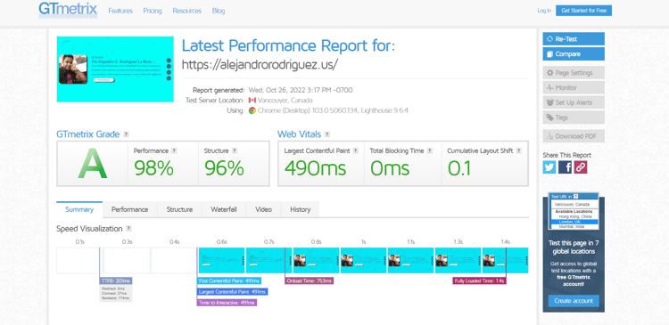
Check out some of the metrics websites can be tested on and opportunities to speed up page loads in the graphics below.


Performance Scoring
The Performance scores come directly from these metrics. This series of checks tells us all about the optimization of our site's pages and how well users are able to navigate our website's content. The main takeaway on Performance Scoring is that by analyzing the scores, we can make changes that will improve the opportunities that directly improve our scores.
Quick Tip — The Real Secret to Improve Performance Scoring
- After you run a website performance test, always check the Opportunity section for suggestions on improving it.
- Always check the diagnostic section for additional content on improving your score.
Accessibility Scoring
Think of accessibility as one of the best practices we follow and implement in order to ensure that our websites are accessible to everyone. Not just for Internet wizards, but for people that might have physical disabilities and for those that do not have the latest and fastest Internet connection. We should always make our website available and free of interaction barriers.
Accessibility scores come directly from the weighted average of all ‘accessibility audits.’ This score assures consistency throughout the pages. For example, we do nothing by just having 10 images, and eight of them have an ‘alt attribute,’ and two don’t. We will get a big zero on the score even though the majority of the alt attributes are present.
But it makes sense if you think about it. There is no such thing as a lot more accessibility, right? We either have the text in the alt text area, or we don't. I mean, imagine if a user, for some reason, cannot view an image and is using a screen reader. Would he give us an eight out of 10 for being able to read the alt text of eight of the ten images? Of course not. We all know it would be a zero.
Quick Tip — The Real Secret to Improve Accessibility Scoring
- The internet is for everyone. The first secret to improving your accessibility score is actually learning about accessibility and how it's important to also reach those that might have vision, motor dexterity, auditory, or cognitive needs through your website.
- Use common sense when designing your website. Think about the user's perspective — how easy is it to navigate through our website pages, and how easy is information found? Make it user-friendly. And use best practices and logic when structuring your markup language and styling your pages as a developer.
Best Practices Scoring
Best practices are our way to ensure our code follows healthy standards and to decrease defects and maintenance costs. Standard best practices are what allow our website to be user-friendly. From displaying images with the correct aspect ratio to making sure there are no browser errors, best practices will enable the user interacting with your website to have a positive experience. This will increase the likelihood they will return.
Best practice audits check whether we have lots of unorganized, unstructured, and difficult-to-maintain source code, also known as having spaghetti code 🍝😂. It ensures our code's health and that it follows the best practices. For example, it checks image optimization, browser errors, and passive event listeners.
Quick Tip — The Real Secret to Improve Best Practices Scoring
- The main idea here is to ensure you're familiar with best practices and take your time when designing your site's overall structure. Think about the pros and cons of the file extensions you use for your images. Make sure images are all the same size and try not to use CSS to modify them. Learn how to compress your images and get familiar with lazy loading.
- Always check for the highlights on website performance test tools for ways to improve scoring. For example, consider adding a layer certificate such as Secure Sockets Layer (SSL) to authenticate a website's identity and enable an encrypted connection. Add functionality to check and validate passwords if your site has user registration and login features. Always maintain your website and keep it up to date. Checking for loopholes will help make a better and safer user experience.
SEO Scoring
Search Engine Optimization (SEO) is the process of making our websites more visible when people search for content, services, and products that are related to our business. To put it simply, it's what allows our website to appear as close to or right at the very top of search engines results pages such as Google, Bing, and DuckDuckGo.
SEO scoring goes from meta description checks to structured data audits. It reflects how search engines rank and understand our website. A poor SEO scoring of our website will prevent our website from being found since the closer our site is to the top of the search engines, the more exposure it gains. More than half of Google users actually click on the pages at the top of their search results pages.
Quick Tip — The Real Secret to Improve SEO Scoring
- Nothing beats great content. Make sure you stay relevant and truthful to your brand, business, or the services you provide throughout all the pages of your website.
- Always ensure to target keywords that are related to your content. Consider the user's perspective and think about phrases related to your content that the users would search for.
- Your website must have the correct meta description and related, descriptive links.
PWA Scoring
Progressive Web Application (PWA) is a website that uses default mobile app behavior. Basically, it allows the user to access a mobile-like application in the browser without having to download it from the app store. For example, Starbucks has a Progressive Web Application that allows the user to have access to most of the application without the need for an Internet connection. This PWA superpower comes from its ability to use the cached data from your previous communication or interactions with the web app.
Quick Tip — The Real Secret to Improve PWA Scoring
- Make sure your PWA is fast and reliable. If you think about the way websites behave, you notice that the user clicks on a page, then the browser sends a request to the server. The server will process this request and send back its response with the content the user wants to access. Progressive Web Applications use what is called client-side rendering. Meaning, that when the user clicks on your website navigation, page, or any content that has the functionality, the application itself is the one that handles this request and updates the content, not the server. A PWA with lots of filler and unrelated content will receive a bad PWA Score. You need to make sure to remove everything that has no value to your users. You want to make your PWA as fast and specific as possible.
Conclusion
In conclusion, you can use many different tools to test your website. In fact, a performance test will help highlight things to improve your website pages and improve the user experience. A good website performance test can often reveal many secrets on how to make your pages optimized and user-friendly.
Oh, I almost forgot — did I manage to watch House of the Dragon premier that day? You bet I did! An hour later, I managed to find a more reliable and well-tested site and had a great time watching it. 🐲
And there you have it, friends, the secrets to scoring an A on a website performance test. Check out this blog, where I talk about how to use the HubSpot SEO Scan Tool to further optimize your website.

.png)
.png?width=100&height=100&name=10%20Signs%20Your%20HubSpot%20Setup%20Is%20Failing%20(+%20Fixes).png)
%20Actually%20Tell%20You.png?width=100&height=100&name=What%20HubSpot%E2%80%99s%20Buyer%20Intent%20Tool%20Can%20(and%20Can%E2%80%99t)%20Actually%20Tell%20You.png)
