We get asked regularly what the dimensions for a Facebook Cover Photo or Twitter Header Photo are, but there are many more design opportunities to pay attention to. Let's get to work...
On Facebook, your social media page designs should include a good Cover Photo, Profile Photo, and Facebook Tabs.
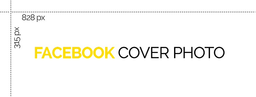
**NEW** Cover Photo - 828 x 315 px

Facebook has FINALLY moved the profile photo, page name, and buttons off of the cover photo. Now you don't need to worry about pieces of your design being covered up or cramming everything into essentially 2/3 of the design. They have also cut down the width of the cover photo from 851px wide to 828px wide. If you're using an older design for your cover photo, you'll want to take a look and make sure that it's not being cropped awkwardly.
Profile Photo - 180 x 180px (recommend design at least 300 x 300px - Facebook will automatically resize)
Make sure the design is square and fit your logo/name/picture within that square. We highly recommend a larger design that Facebook will resize.
Facebook Tabs - 111 x 74px

These are under utilized, but look great when they're done well. Understand that with such a small image size, you can't put much on them or they're not going to be readable. Simple is best here.
Twitter social media page designs should include a header photo and profile photo.
Header Photo - 1500 x 500px

Twitter's Header Photo is a little trickier than Facebook's Cover Photo. The grey areas are areas to try to avoid. The top is a safe zone (60px). Anything in this area is likely to be cut off. The sides are not visible on mobile - give yourself a 250px buffer on each side if possible.
Profile Photo - 400 x 400px
Another square image is needed here. Make sure your logo/design/image fits in a 400x400 design the way you'd like it seen.
Google+
Google+ social media page designs should include a cover photo and profile photo.
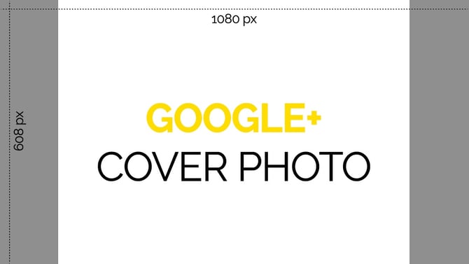
Cover Photo - 1080 x 608px

Google+ also has some buffer space that is needed so your design isn't cut off on smaller screens as well. Give yourself about a 125px buffer on each side to avoid anything being cut off.
Profile Photo - 250 x 250px
Google+'s profile picture is a little bit different than the others because it'll show up round on your page. Make sure your design/logo/picture is centered in the 250px square because you'll lose the corners. Another cool feature of Google+'s profile photo is that you can use a transparent image. If you have a png logo without a background, that can be used and no background will show behind it. (+10 points for being this cool ;) )
The social media page designs for LinkedIn should include a profile background and profile picture and a business image and business logo if you've got a company page.
Profile Background - 1400 x 425px

There is not a lot of room to be too fancy with your design here because the content from your profile and an ad area cover up most of it. Be simple. Give yourself a 50px buffer on top for the ads and keep any logos or designs towards the sides.
Profile Photo - 300 x 300px
Keep it square. LinkedIn will actually show you what it'll look like in all different sizes and formations. Way to go LinkedIn. ;)
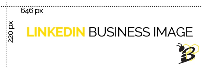
Business Image - 646 x 220px

This one is nice because there are no crop areas that you have to worry about. Just design at that size and you're golden. :)
Business Logo - 300 x 300px
Square again. Center your logo/design/picture.
One final tip - if possible, use .png files instead of .jpg files. Some colors can appear pixellated (reds especially) on some networks if you use a .jpg. Use a .png file to avoid this.
So now that we've gone through all of this, you're probably thinking, "well it's great to know the correct dimensions, but I'm not a designer!". Most poor social media designs are a result of simply not knowing how to design. Well we have that answer too!
Our friends over at Canva make it SUPER easy to design beautiful social media cover photos and more with NO EXPERIENCE NEEDED! So what are you waiting for? Get started creating for FREE!


.png?width=100&height=100&name=10%20Signs%20Your%20HubSpot%20Setup%20Is%20Failing%20(+%20Fixes).png)
%20Actually%20Tell%20You.png?width=100&height=100&name=What%20HubSpot%E2%80%99s%20Buyer%20Intent%20Tool%20Can%20(and%20Can%E2%80%99t)%20Actually%20Tell%20You.png)
