Today, everyone knows how important a good website is. It's like your online face to the world. But contrary to popular belief, a website makeover is more than just a cosmetic change. It includes creating a more intuitive and streamlined user experience (UX), implementing SEO best practices, and more. In this article, we will highlight a few of the successful website makeovers HIVE performed, and we will show how these websites changed from before to after our work.
OnlineMedEd's New Look
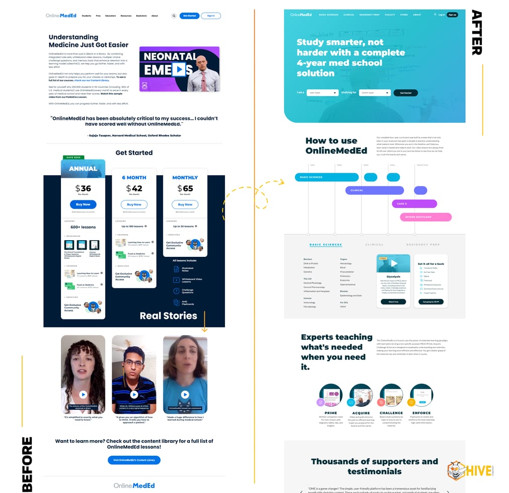
OnlineMedEd, an educational hub for medical students, was facing a dilemma: Their website was in need of a redesign to give it a more cohesive look and a more intuitive user experience. OnlineMedEd embarked on a significant website migration and redesign project with HIVE Strategy, aiming to transfer their platform to HubSpot CMS. The objective was not only to refresh the website's appearance for a more modern and appealing look but also to enhance its user interface, making it more intuitive and accessible.
When you landed on OnlineMedEd's old website, you were greeted with a dated look, and It was very difficult to figure out what services the company offered or who they served. We laid out the front page with fresh content that made it clear what OnlineMedEd does and who they serve, and the restructured navigation made it easier to find your way to the information you were looking for.
A Custom Thinkific Integration
Integrating OnlineMedEd’s website with Thinkific presented a big challenge to us because no out-of-the-box solution existed for it.. HIVE came up with a special fix. We built a custom integration to link Thinkific to HubSpot CMS using similar examples from other coding languages, and making clever use of HubDB and HubSpot’s serverless functionality.
The Outcome
The new website was a big win! Students found it much easier to use. The best part was how well OnlineMedEd's course platform and HubSpot CMS worked together after HIVE's work. This meant better handling of information and a smoother experience for everyone.
Learn more about the OnlineMedEd website makeover.
DSST Public Schools Website Makeover
DSST Public Schools operates 15 middle and high schools in Denver and Aurora, Colorado. They’re known for great STEM education. They wanted a website that could show off their focus on science and technology and be useful for their community. But with so many schools in their district,
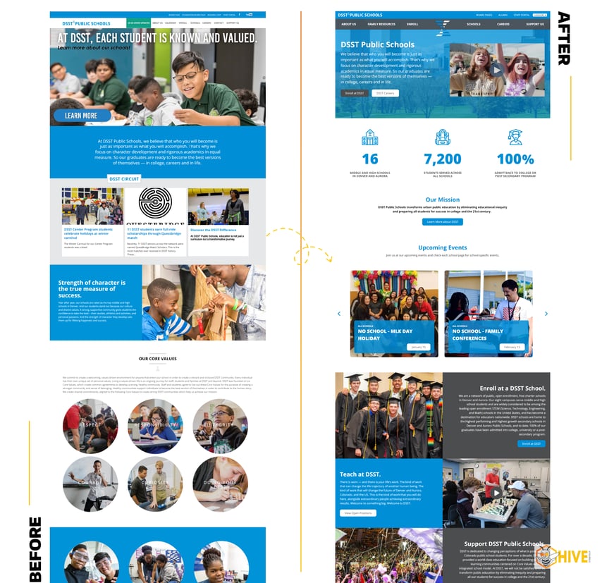
With so many schools in their district, DSST faced the challenge of creating a website that could grow and change with each school - one that would allow each school to make their own webpage uniquely their own while still keeping the overall structure consistent with the webpages of the other schools in the district.. They wanted each school to have its own style but still feel like part of the big DSST family. This website needed to be flexible and ready for whatever changes might come in the future.
We started by creating a site map that was easy to navigate and would create a natural flow for the user journey. We developed a dynamic theme for DSST’s website that each school could tweak to fit its style when creating their own webpage. We also created specialized modules to empower each school to effectively communicate and connect with their community. These custom modules included features for showcasing testimonials, a tailored RSS feed for sharing school news (integrated with Flyer), a Google maps feature for location selection, dynamic social media integration, comprehensive staff directories, and searchable accordions for ease of information access.
The Outcome
The new website was a hit! The new dynamic theme, tailored to each school's unique style within the DSST network, fostered a sense of individual identity while maintaining a cohesive brand appearance. The addition of custom modules enhanced communication and community engagement. This flexible and user-friendly design successfully met the evolving needs of the schools, ensuring a robust online presence for the entire district.
Learn more about DSST Public Schools website makeover.
We Gave Our Own Website A Facelift
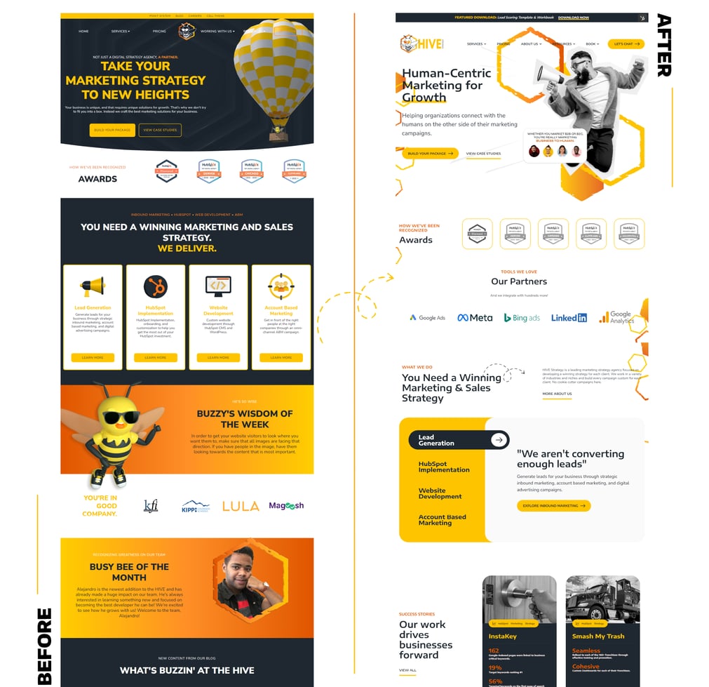
As HIVE Strategy prepared to go into INBOUND23 as a sponsor and speaker, we wanted to ensure that our website presented us in a way that was clear, concise, transparent, and encompassing of our values. That is when we decided it was time to redesign and revamp our website. Our previous website was very dark, focused heavily on our services, had a very robust and overwhelming navigation, and incorporated our mascot, Buzzy, heavily. It wasn’t the inviting or human-centric design that we needed moving forward.

In creating the new website, we adopted more of our CEO’s principles from his book, Market Like A Human. We created a more welcoming design by embracing a light theme with pops of color and subtle animations. We focused our messaging and language around the needs of our audience, rather than what we could sell them. We reduced the usage of our mascot in favor of images of people to create a deeper connection with our audience. And we reduced the navigation to make it easier for our audience to find the information that they were looking for.
The Outcome
By revamping and relaunching the HIVE Strategy website, we saw a much better connection between what we offer and what our audience is looking for. That has come through in the sales process as well as the data. Since the relaunch, we have seen our bounce rate decrease by about 4%, a 45% increase in session length, a 2% increase in returning visitors, and our session to contact rate increase by about 17%.
These website makeovers are standout examples of how vital a well-thought-out website redesign is. They show us that a good website isn't just about looks; it's about creating a space that's easy to use, informative, and truly reflective of an organization's mission and spirit.


.png?width=100&height=100&name=10%20Signs%20Your%20HubSpot%20Setup%20Is%20Failing%20(+%20Fixes).png)
%20Actually%20Tell%20You.png?width=100&height=100&name=What%20HubSpot%E2%80%99s%20Buyer%20Intent%20Tool%20Can%20(and%20Can%E2%80%99t)%20Actually%20Tell%20You.png)
