Heat mapping tools are one of the most powerful tools available to a marketer that is looking to make a more effective website. They give reliable information using real data tracked from your visitors. This allows you to know exactly what users are doing on your site and gives you vital information for upgrading your site. If you are not currently using a tool like this to monitor your site health, you should be. Here are four tips to help you get the most out of heat mapping tools and start converting leads.
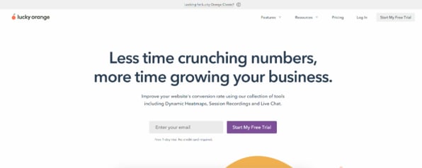
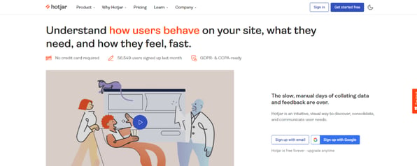
Expert Tip: If you are wondering where to start looking, you can check out Lucky Orange or HotJar to see what options are available to you. I have used both in the past and think they do great work!

Tip 1: Know your options
Most heat mapping software will have at least three kinds of maps for you to look at:
- Click Maps
- Scroll Maps
- Hover Maps
All three are important for understanding your website so let’s dive deeper into what you are seeing.
Click Maps
Click maps are probably what you think of first when you imagine what heat mapping software is. These kinds of maps show you where visitors on your site are clicking and in what numbers. Normally, the number of clicks is represented by small circles of color that range from blue (low number of clicks) to red (high number of clicks). The element does not have to be clickable to be tracked. This has the added benefit of letting you know if the visitors to your site are expecting a section to be clickable, even when it is not.
Have you ever wondered how many people click that demo CTA at the bottom of your page? This is where you find out!
Scroll Maps
Scroll maps are a representation of how far the user has scrolled down the page before leaving it. These are the most linear of the maps where you will see the visitor numbers whittle down over the course of a page. The reasons they leave can be positive — leaving for another one of your pages and continuing their journey, or negative — leaving the site entirely due to not finding what they wanted.
The scroll map will let you know how many of your visitors even saw the CTA off you had at the bottom of your page!
Hover Maps
Finally, we have the Hover Map. This is the trickiest one of the bunch to use because it doesn’t track a specific event on your page. Instead, it tracks where your users are hovering their mouse as they use the site. You will be able to see what sections of the site are drawing the eyes of the visitor and what elements they find the most enticing.
You might be surprised to learn that more users than you think read your pages by using the mouse to track where they are!
Tip 2: Cross reference what you find
Every one of the maps has its uses alone, but they really shine when used together. The most important thing when making decisions from this information is context. Knowing how many people click on a specific CTA on your page is important, but it becomes powerful when you combine it with the data you have about how many people even see that part of the page.
You might think that the CTA down on your page is underperforming due to a low click count, but that may not be the full story. After looking at the CTA, you can pop over to the scroll map and see how many people actually saw the button to click on. Comparing these two data points may show you that the CTA has a very high percentage of clicks for the number of people who saw it and may even need to be moved up on the page.
This is especially important when it comes to hover maps. These require the most context from the other two maps because they don’t track a specific action. They just look at where the mouse was positioned on the page. Going just by what this map says could lead you to incorrect solutions about what the data is telling you.
Tip 3: Take the data seriously
It is fairly well understood that people tend to reject things that go against what they believe. This is a fact of human nature you need to be very aware of in marketing because it can cause you to miss decisions that will help your business. It is important not to come up with excuses for why the data is a certain way. You might really like a section of your site and not want to change it, so you begin finding reasons that the clear data showing it is not working is wrong.
The saying, “The customer is always right,” is one that is usually misinterpreted. It is not saying that you need to bend over backward to please your customer. Instead, it is saying that if people are not buying what you are selling, then you are the problem. Heat maps are the ultimate indicator of this on your website. If you think a section is great, but no one clicks on it, it is not doing its job and needs to be adjusted.
Tip 4: Don’t focus on the fold
One important thing that all programs do is show you the fold of your website. This is valuable information because it lets you know the default state of your website and what most people are seeing. I have noticed that this distinction causes people to hyper-focus on above-the-fold content and not think about what it means for the rest of your site.
It encourages you to look at the top of the screen fold as the most important part of the map. You hear about it all the time, right?
While knowing your fold is important, it is more valuable to understand the relevant breakpoints on your site outside of the fold and adjust accordingly. Do not just look for the convenient line showing you the fold for your site. See where on your site people are dropping off and look for where they are going. It is important to know whether or not half of your visitors will even see a section of the site. If that’s the reason, you need to find ways to place that information higher on the page.
It also comes with the added benefit of letting you know when the page is overloaded with content. What is the point of a long page with a lot of information if only 20% of the people are seeing it all? You may need to work on other ways of getting people to access the information they otherwise would never see.
Get started with heat maps today!
Heat maps are one of the most powerful tools you have in order to improve your website performance, so treat them like one. Make sure you understand what information they give you and how to use it. It may even be a good idea to read some articles on how scientists collect and use data in order to adjust your own practices.
The Scientific Method may be something you learned from Ms. Frizzle, but it is an incredibly effective process for collecting and understanding the information available to you. It will help you use your heat maps to turn visitors into happy customers and bring you closer to the ideal website that sells for you.


.png?width=100&height=100&name=10%20Signs%20Your%20HubSpot%20Setup%20Is%20Failing%20(+%20Fixes).png)
%20Actually%20Tell%20You.png?width=100&height=100&name=What%20HubSpot%E2%80%99s%20Buyer%20Intent%20Tool%20Can%20(and%20Can%E2%80%99t)%20Actually%20Tell%20You.png)
